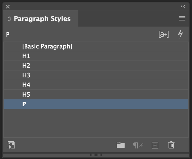
Paragraph Styles
- Goals for this Lesson
- Why We Need Them
- Styles & Hierarchy
- Setting up Paragraph Styles in InDesign
- Styling Paragraph Styles in InDesign
- Advanced Paragraph Styling
- Making Changes to Styles
- Styling Numbered Lists and Bullets
Goals for this Lesson
- Understand Why Paragraph Styles are Important
- Learn to use them effectively
- Learn to use them as an efficiency tool
- Learn some common mistakes people make with paragraph styles
- Help you learn to love InDesign (I hope)
Why We Need Them
As print designers, and especially if we are working with InDesign, it is very important to create and name one style for each level of typographic hierarchy.
Paragraph styles might be InDesign's most important tool
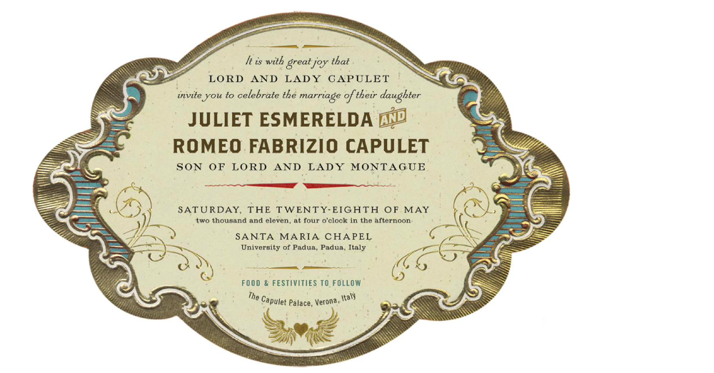
Imagine that a client asks you to design a menu. It needs to be clear. It needs to be scannable. It needs to be consistent. It needs hierarchy. But it also needs to be easy for you to create, work on, and maintain. There will be dozens of menu items. Some will need extra information like add ons, some will not. The client is going to want changes.
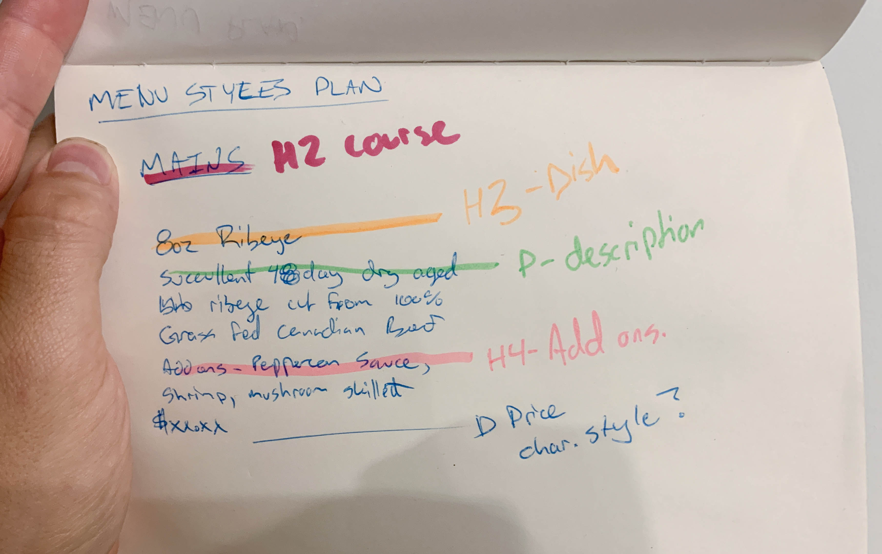
A quick sketch I made to see what headings I may need to create styles for.
Paragraph styles are a tool to plan and design the typographic hierarchy, as well a time saver when the design needs to change.
Styles & Hierarchy
Remember last week we talked about hierarchy, and how important it is? Paragraph Styles are one of the main tools we use to make that hierarchy. Typographic hierarchy applies to both print and web design. So do Paragraph Styles (but we won't look at CSS here...unless someone wants too?).
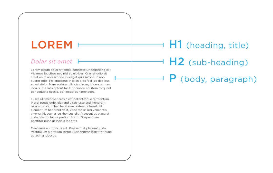
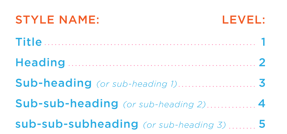
Why do they have those names...h1, h2, p, etc?
You may be more familiar with seeing the levels of typographic hierarchy described using terms like title, subheading, and body. I do not recommend you use those terms. One problem is that they can be confusing. For example, the difference between heading and a title will not always be clear. Let's look at these:
The title of what?
How should we refer to these paragraphs styles? What about:
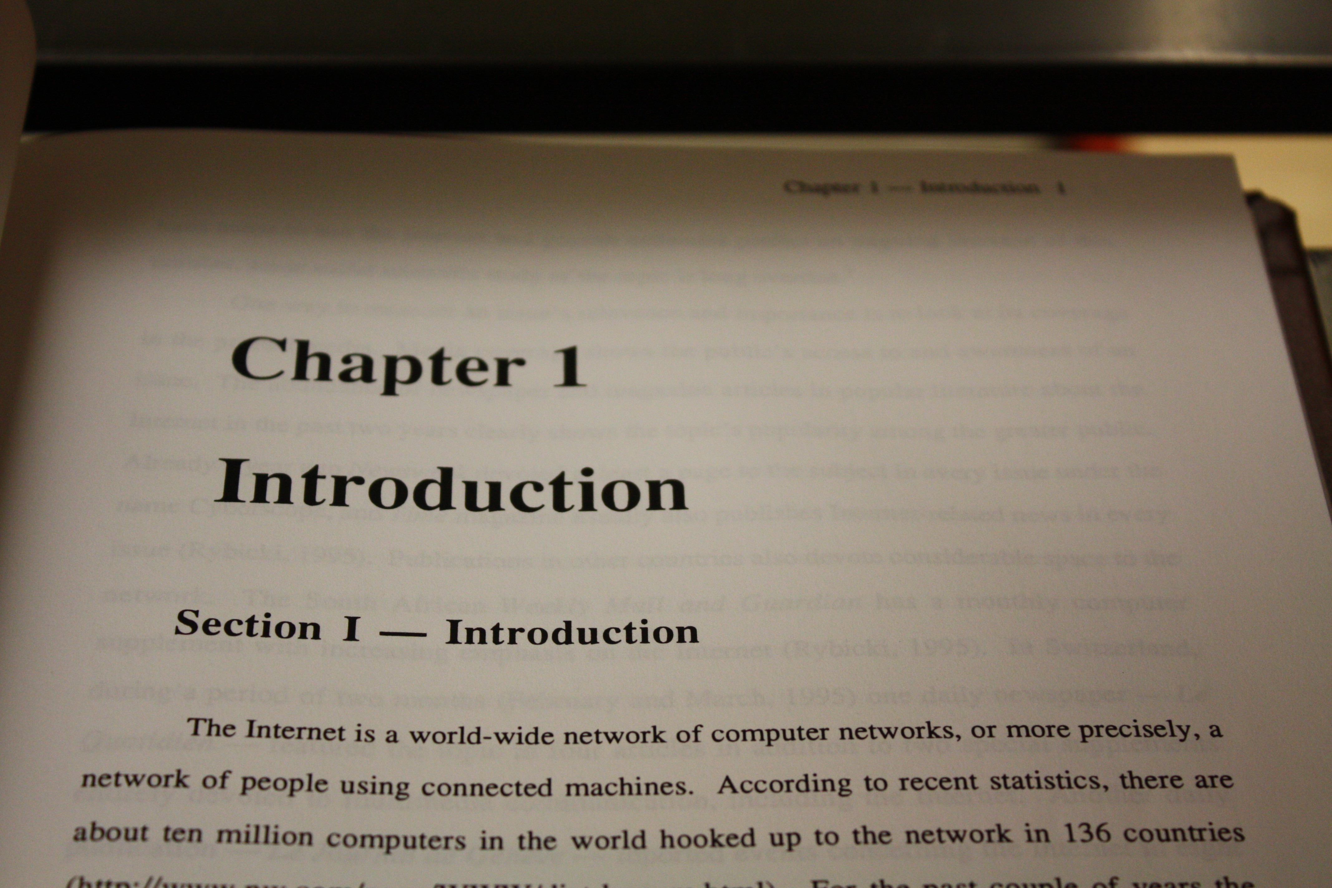
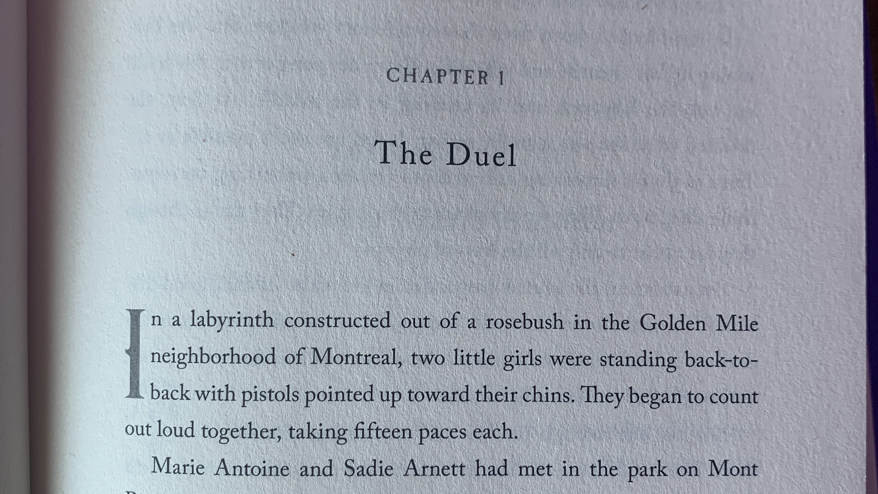
- Heading (Chapter 1 / Chapter 1)
- Title (Introduction / The Duel)
- Sub-heading (Section 1 - Introduction)
or maybe,
- Sub-heading (Chapter 1 / Chapter 1)
- Heading (Introduction / The Duel)
- Section-heading (Section 1 - Introduction)
Either one could make sense because they are ambiguous. Unanswered question arice like "is that title the book's Title or the Chaper?" and "Between the sub-heading and the section heading, which is higher up the hierarchy, and what is between them?" Paragraph styles are supposed to make life simpler, not more confusing.
The term "H1" is a convention that always applies to the highest level of hierarchy in a given document. A book's title is H1, the masthead on a Newspaper is H1, the first BIG TEXT that you see on a website is H1.
So let's apply that:
- H2 (Chapter 1 / Chapter 1)
- H3 (Introduction / The Duel)
- H4 (Section 1 - Introduction)
- P (body text)
The connection between the organizational hierarchy and the style names is less ambiguous.
There is much less ambiguity here, we have a numerical structure that is easy to reproduce, and any can come along and understand it (which will become very important down the road).
A second problem is that "Heading, subheading" can get very confusing on large documents with require a complex hierarchy which the designer may be asked to change again and again. We can add sub-sub-heading of sub-heading-2. But sub-sub-heading or sub-heading2 would be 3 or 4 levels down on the overall hierarchy. Something like this:
makes no sense please don't be like this
How can you make sense of this? How can someone else? What if something changes from the copywriter, and you need to add something between sub-sub-heading and sub-heading. Does it become sub-heading-b?
Source Philosophical Penguin
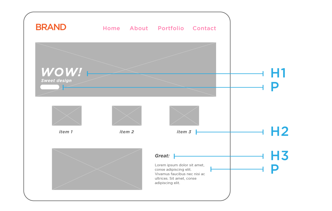
Many designs will have a non-linear hierarchy, which makes "heading" and "subheading" nonsensical. Look at the example below. Is it clear what is a heading, subheading, section, sub-sub heading? Does it matter?
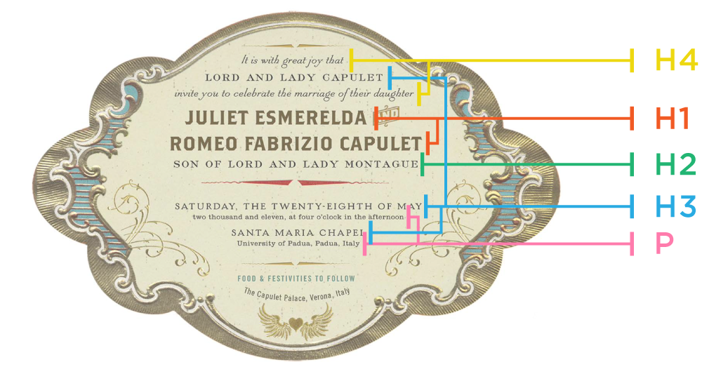
The style hierarchy can't be expressed as "subheadings" or "sections."
In an example like this one, we really just want to keep it organized. The higher the number, the more visually prominent the style.
The last reason for using H1, H2, H3, p, etc, is that it is a simple standard that the entire team can use. As a designer you recieve copy from a copywriers supplied via MS Word or Google. Those styles are not the same, and they probably won't be the same as what you have created in your InDesign file:
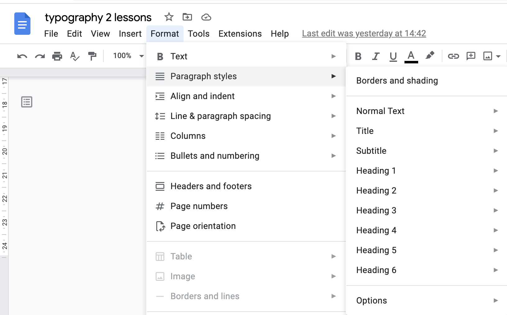
Google Docs' default styles. Not Bad.
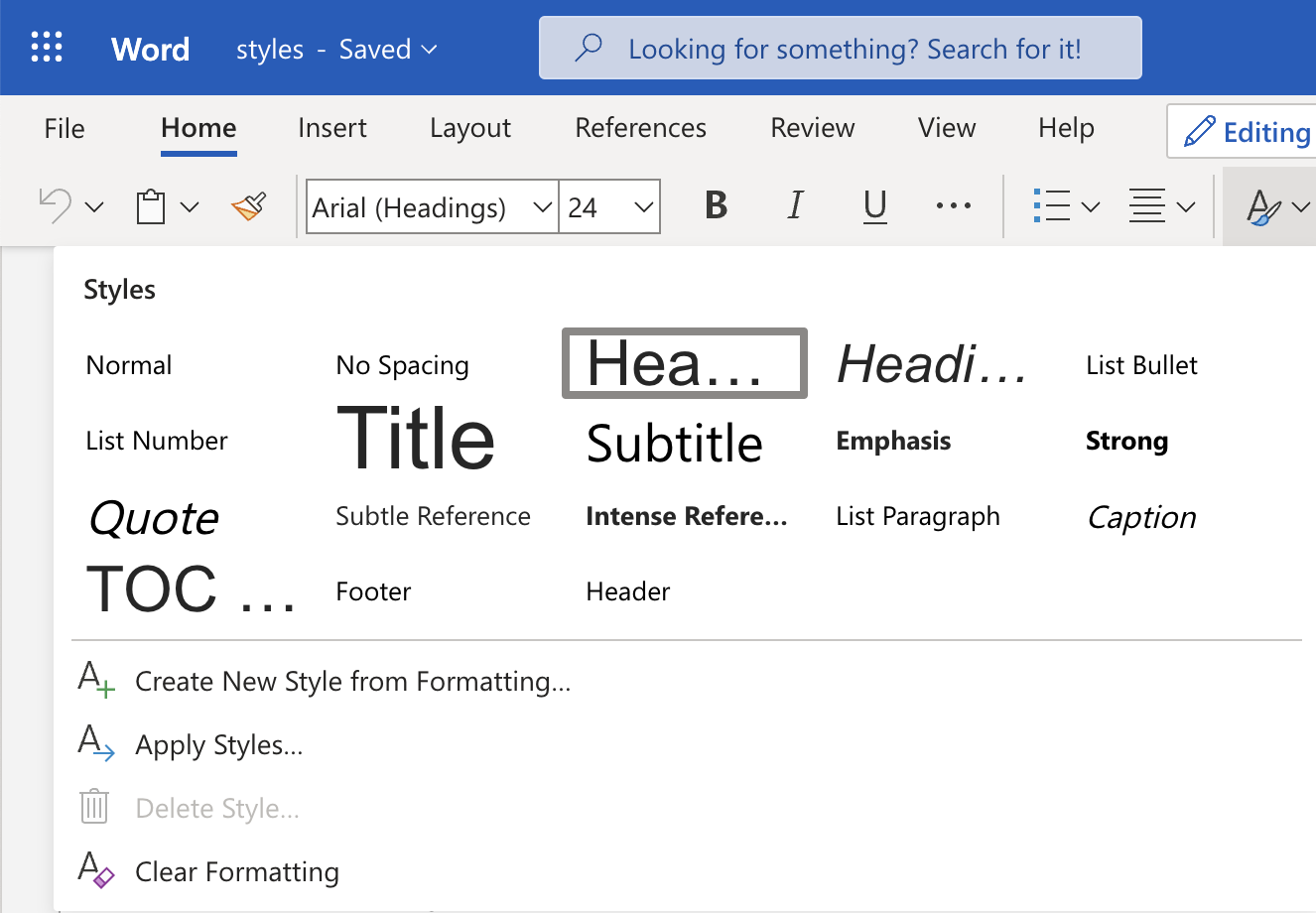
MS Word's default styles. %@^&$!!
In addition to copywriters, Graphic Designers also work with Front End Developers (web coders). Guess how they name their paragraph styles? You guessed it:
See the Pen Untitled by Teaching Tools (@teachingtools) on CodePen.
That means when you pass your design off to the web developer, they will be your best friend. And if the work comes back to you, perhaps some technical reasons requiring the design to change, the communication will be very easy.
Ever wonder how PDFs are tagged for screen reader accessibility in? Yep, p, h1...:
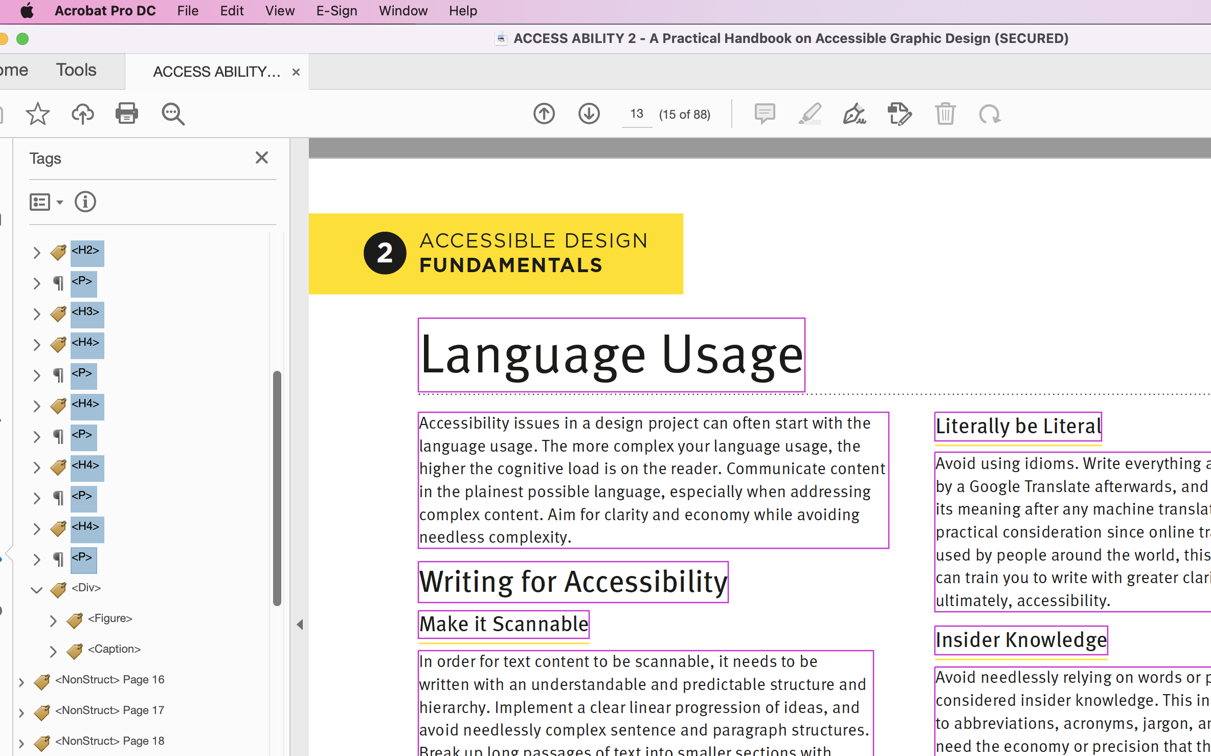
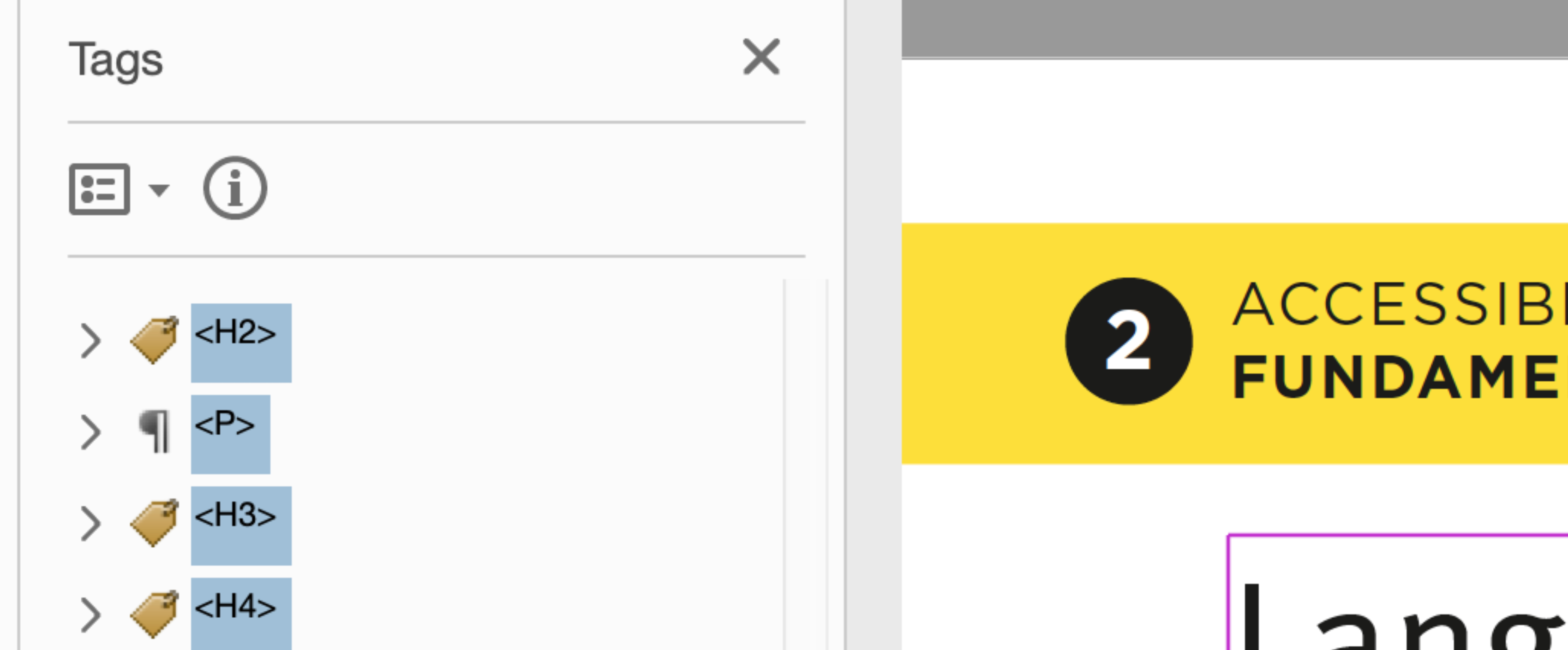
Content "Tags" are what screen readers use to understand and scan document hierarchy.
Setting up Paragraph Styles in InDesign
Before we Begin
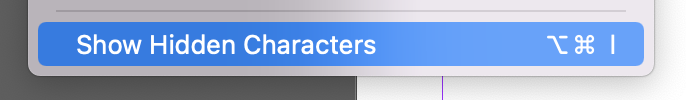
Whenever we are working with styles and typesetting, we want to turn on "hidden characters." Do that from the Type Menu, and scroll to the bottom to find "Show Hidden Characters."
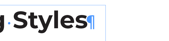
The Pilcrow (¶) is the symbol for the end of a paragraph, but it also accepts styles for the entire paragraph.
Highlighting the pilcrow and applying a style applies it to the entire paragraph.
Let's start building paragraph styles. Please load up InDesign.
Setting Defaults
If you do a lot of work in InDesign, then you will want to find as many time saving tools as possible. One of them is pre-making at your paragraph style names so they are always there when you open a new document.
The way to do that is to open the Paragraph Styles panel with no document open and then just create the paragraph styles.
Now every new document I start will always have those style names pre-made.
"Based On" Setting
The "based on" links one style to another. Suppose we tell H1 to be "based on" P. When we make changes to P, those changes will apply to H.
If one style is based on another, then it will inherit style applied to its parent.
Notice that once you modify a parameter (such as font size, leading, indent, etc) the style will stop inheriting any changes to that parameter from the parent.
- When might this be useful?
- When might this be annoying?
Next Style
The Next Style setting defines what style will automatically be applied to the following paragraph. By default the next paragraph will be set to the same as it already is. So if the style applied is "P" then the next paragraph with also be "P." But in many cases we nearly always want to follow one paragraph with another. For example we may have a document where H3 is always followed by a P.
Style Shortcuts
We can also program shortcuts to our styles. This allow us to use key combinations to apply a style to a paragraph, which is faster than the panels. You can choose your own key-combinations to do this. I like to use shift-option-(numbers 1-9) for Apple and shift-alt-(numbers 1-9) for Windows. H1 = 1, H2 = 2, etc, and I use 9 for P because 9 kind of looks like a backwards P. You can try other combinations but you may find they interfere with default shortcut combination keys.
- H1 = shift-option-1
- H2 = shift-option-2
- H3 = shift-option-3
- H4 = shift-option-4
- P = shift-option-9
Shortcuts can help save time
Applying Paragraph Styles in InDesign
Download the Example to follow along.
One Text Frame
We want to reduce the number of Text Frames as much as possible. You should not have a text frame for each paragraph or heading.
This is an example of what not to do.
If you arrange your document like the image above, any change requires you to move and manipulate multiple text boxes. Imagine you have a large document and you need to change the first paragraph to be shorter or longer. That would require manually repositioning every single text box that follows.
That's why we want to use as few Text Boxes as possible (ideally one per page) and link them all up. Like this:
Adding a new text frame and linking it to an existing one.
Styling Body Copy
Generally I like to start styling with the body copy (the P style). Body copy is what we have the most of, it is the smallest, perhaps hardest to read, and typically has the most complex content. I want to design my headings around the body copy, not the other way around.
Lock to Baseline:
One thing we want to do is align our body copy to the baseline. This will ensure that all lines of text...line up. This is especially important for multi-column layouts.
- Style P's font size and leading size
- Set the document Baseline to match P's leading
- Turn on "Show Baseline Grid" so you can see the baseline
- Style P to align to the grid
Aligning P to the baseline
Pick a typeface
This one is easy!
Decide on Text Alignment
Generally we want left-aligned, ragged right. If you use a rag, I advise that you turn off hyphenation.
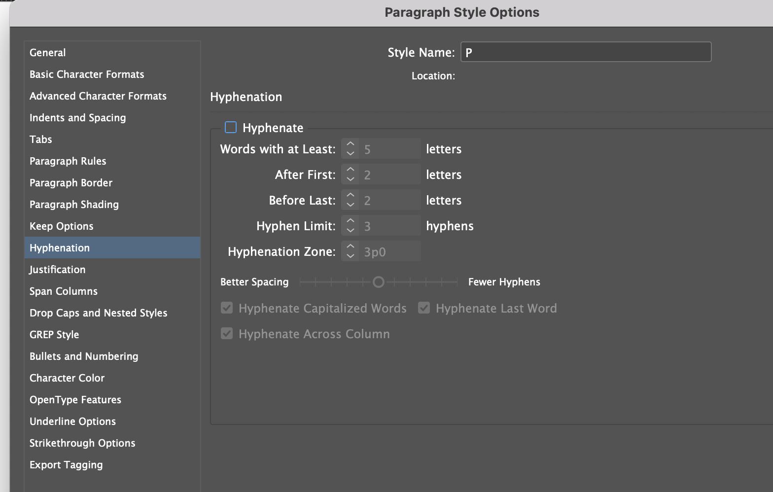
Turning off hyphens by unchecking them from the Paragraph Style.
If you use Justified Text, you will want to adjust the limit of how many hyphens can appear in a row (3 is too many), and avoid breaks in words that lead to confusion. You also have to be aware of the Hyphenation tab (sometimes called "Hs and Js)."
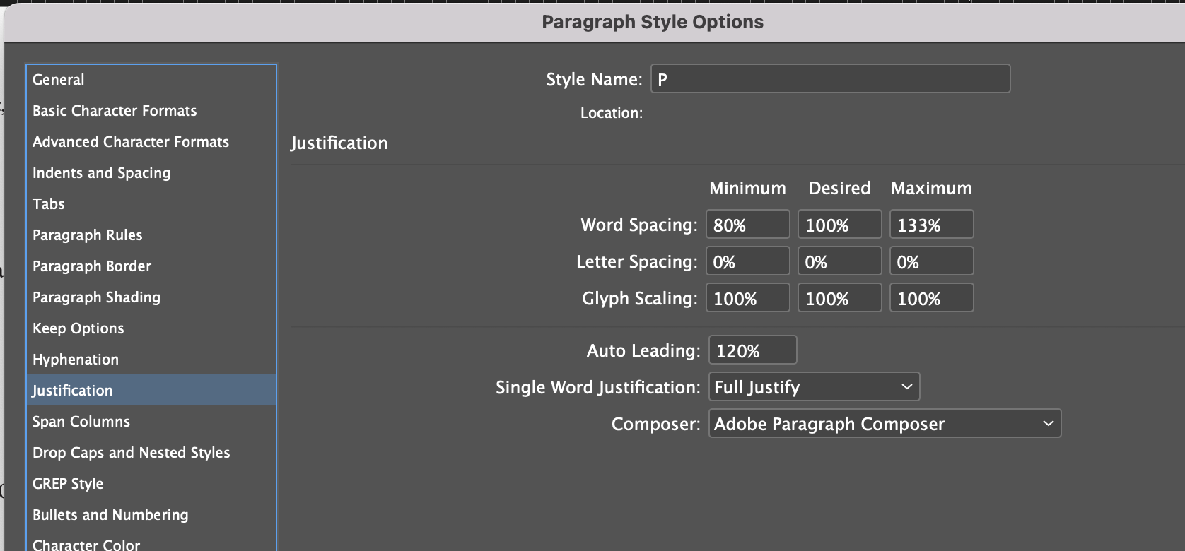
This is where you can avoid rivers and bad hyphen splits.
This window changes the spacing between letters and words, and the size of letters (actually, all glyphs) making the text able to expand and contract. That can make it easier to remove rivers, widows, and orphans. But it can also make the text unreadable. The correct settings depend on the typeface, size, line length, etc. Take it case by case.
Space Before, Space After
This adds extra space before or after the text. You should never ever use an empty paragraph to create space between paragraphs.
no no no
Does anyone know why?
Because we have locked to body copy to the baseline, the Space Before and After behave a bit strangely. It will seem like they do nothing, until suddenly it adds an entire leading line of space.
Adjusting the space after
The "Space After" is being overruled by the alignment to the baseline (which is a good thing). I set my Space After to match my baseline and leading, just to keep it tidy.
Styling the Headings
There are a few considerations when it comes to styling headings.
- Are they the same typeface as the P style, or are you mixing?
- If so, you may want to use "based on" or you may not
- Are they all the same typeface family?
- If so, you may want to use "based on"
- Are you using colour, underlines, etc, and are those consistent or different at each level?
- Do the Headings Span Columns?
- If so, which ones?
Work From Smallest to Largest
The nice thing is, if we create styles that we don't like, it is easy to change them. As long as the styles are applied to the paragraphs in the text, then changing the Paragraph Style will change every instance of it in the text.
I like to work upwards from my body copy. Its good to think about this before moving into digital. Here is my plan:
- H1 Menu
- H2 Course
- H3 Dish Name
- H4 ? not sure yet, maybe add-ons?
- P description of the dishes
So H3 is next. H3 is telling the reader what the body copy below it pertains to. They are directly linked, therefore, I want them close together because that is how humans infer hierarchical relationships between items. So I will style a H3 to ahve no space after, and use the shortcuts to apply it quickly.
Using a shortcut combo to quickly apply styles to paragraphs
From there you can add any other basic styling - font size, cut, colour, etc. I changed the font weight to medium.
Next is H2, which is the course - Antipasti, Mains, Salad, and Pizza. I want these to be obvious so people can jump to them and get a sense of the restaurant's offerings, but I do not want them to be so big that they are distracting.
I decided to try filling in a background, and then knocking out the text. I will:
- Add Paragraph Shading
- Change the Text Colour
- Apply that style to all H2 paragraphs
- Adjust the Font Size and weight if needed
- Change Alignment or other options if needed
Adding H2 style and getting some hierarchy.
Maybe we need to add an H1 title. Let's do that now. I am going to write the name of the restaurant at the top of the menu. But it wont fit, so I need to use "Span Columns." I may also need to adjust the Space Before and After.
Using span columns for this Particular H1
And that will leave you with a basic layout, locked to a 12-pt baseline grid. The styles also serve as a template of sorts...you can modify this for other brands and applications. Just map the styles onto the content, and adjust as required.
Now we have a simple hierarchy all set up
Do you see anything wrong here?
Advanced Paragraph Styles
Let's fix some issues, starting with the widows and orphans.
Widow: When the first line of a column is the last line of a paragraph.
Orphan: When the last line of a column is the first line of a paragraph.
Runt: When the last line of a paragraph has only a single word.
Remove Widows and Orphans using the "Keep With" option
A widow is alone at the top (of the family tree)
An orphan is alone at the bottom (of the family tree)
"Keep With" is a tool that keeps two paragraphs together. This is especially important in our H3 (dish name) and P (dish description) styles, which we do not want to seperate from one another. So we tell H3 to "keep with" following lines.
Now the H3 will always keep with the P
Keep With can also keep lines of a paragraph together, especially the last line of a paragraph. That's how we remove widows.
GREP to remove Runts
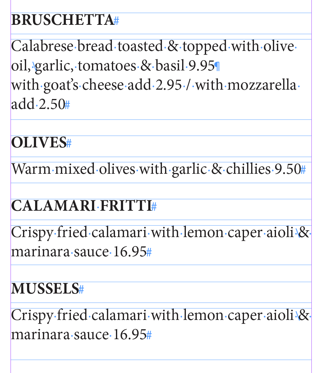
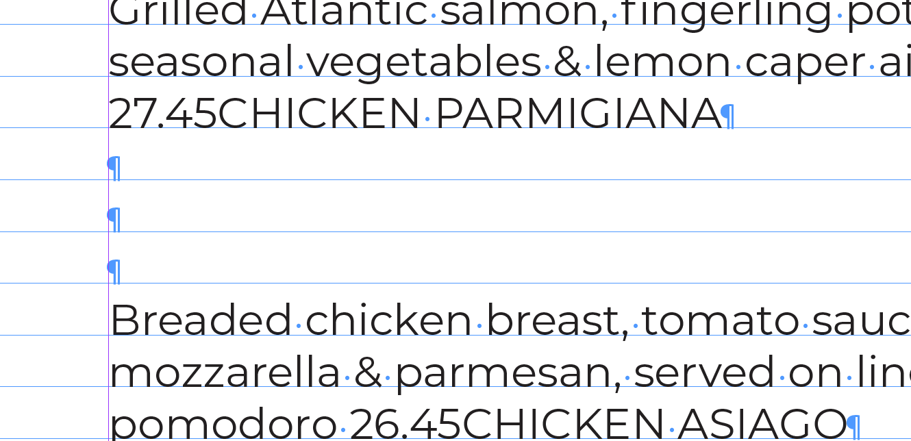
Runts occur when the last word of a paragraph is all alone, on its own line. Like this:
The word "mixed" is an example of a runt.
We do not like runts because they leave nearly an entire line of empty text. This creates a the impression of a paragraph break where these is none. It unbalances the text. Having runts in your work will make you look like a Jr.
You may have noticed we have some Runts in our menu.

An orphan, or one word of text alone on a line.
You may be tempted to fix this with a soft-return (shift-return).
It is not a good idea to fix it like this.
Can you see any issues with this approach?
GREP is command-line utility for search text for a "regular expression." Very roughly speaking, a regular expression is just an expression in text that happens "regularly" but in the sense of "often." It is similar to using find and replace (or find and change).
GREP commands can seem a little bit odd but they are very useful. Let me show you one to find orphan:
What the...? Don't worry, it's simple. These are the "find" instructions. They are looking for a regular expression, they are looking for:
- The "." (dot) means "look for any character"
- {10} means look for any sequence of 10 or less characters
- $ means look for the end of a paragraph
And then we want to apply a "no-break" style to them. "no break" just means "do not break those 10-characters up over a line (including space). So what I will do is:
- Create a character style that does not allow breaks (check "no break")
- Use GREP to find the last 10-characters of every P paragraph and apply the no-break ONLY to those last 10-characters
GREP will now handle runts for your entire document. I can't tell you how helpful this is.
GREP will now handle runts for your entire document. I can't tell you how helpful this is.
GREP to style numbers
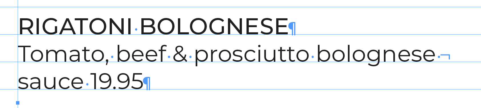
We have prices in our text. What if I want to select them, and apply a special charachter style. GREP can do that with:
\d means "any digit." Prices are usually x.xx or xx.xx. So .\d.\d\d means "select any digit and the next two digits followed by a "." So we can use that to apply a specific Character style within a Paragraph Style. Like this:
GREP will now automatically style all prices as you create and update your menu.
What else can Grep do? What do you think this does:
Making Changes to Styles
It's strange to think, but part of the reason we make styles is so that we can change them. Paragraph styles make it easier to apply updates throughout an entire document. Don't like the size of the headings in your 200 page document? Change the style. Did the copy editor just add 1-paragraph to a full document? Time to tuck in the leading by a fraction of a point (don't tell anyone).
When you edit styled text without using Paragraph styles, it can cause problems. This is something we all do - maybe you used a shortcut to test a font size change. Maybe you added an underline quickly from the top menu. When you do that, a "+" will appear beside the style.
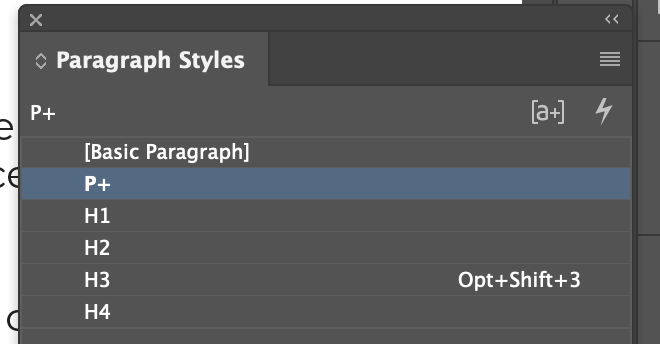
The plus beside the P indicates there is an "override."
The plus means overrides have been applied. It means that the Paragraph Styles for the currently selected text have been modified or added too. This is bad, and you want to clear them because they can cause you pain.
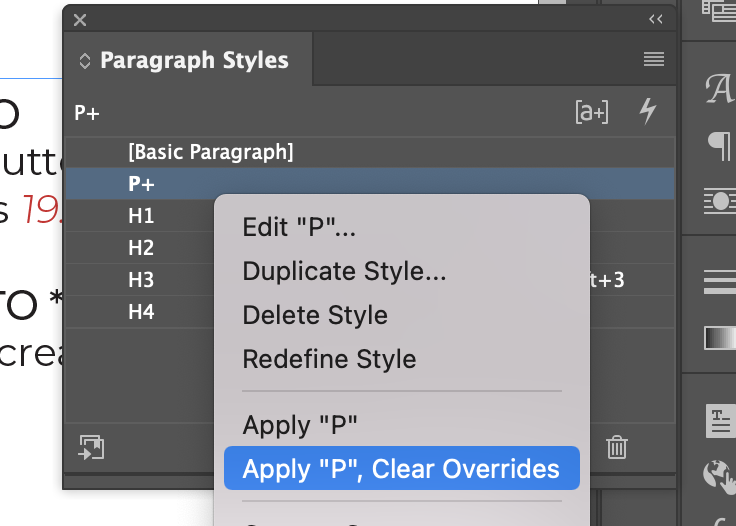
Right click to clear the overrides.
Occasionally you may have intentionally applied those overrides. Maybe you said "I wonder what this would look like a few points smaller? In that case you want to press "Redefine Style" which will apply that change to all other paragraphs with that Paragraph Style Applied:
Redefine Style takes local overrides, and applies them to the Paragraph Style.
Styling Numbered Lists and Bullets
It is very important that you use hanging indents to style bullets. We will:
- Remove the formatting pasted in from the client
- Make a P style
- Make a bullets style and base it on P
- Adjust the left indent a positive number
- Adjust the first line indent a negative number
Hanging indents are the correct way to prepare bullets.